
Meet a Medievalist Maker: Victoria Craggs
“Meet a Medievalist Maker” is an ongoing series of blog posts introducing our members and the work they are doing. Each post is organized around our Four P’s: a project they are working on (or have completed but want to highlight); their process: medium, etc; a peek at their work: images or excerpt; and a prompt: instructions for a brief exercise they share to allow readers to experience/explore their process. Would you like to write a post introducing yourself and your work? Send us an email!

Recently at an event, a friend hesitated as she introduced me: “This is Victoria, and if you didn’t know, she likes doing things.” These things tend to vary. I am a senior designer and developer, specialising in haptic technology, UX design, as well as in graphic reimaginings of medieval texts. As a DAAD (Deutscher Akademischer Austauschdienst) scholar based in Freiburg researching movement in Chaucer’s works, I also have the privilege of working creatively and collaboratively within the medieval community on projects ranging from graphic design for the New Chaucer Society Biennial Congress to creating creative-critical responses to medieval retellings. Other projects approach coding as a research method, including the creation of haptic gloves as well as Chaucerian chatbots, and other new ways to digitally introduce Middle English to students through DEVYSE.
Process
As a designer and developer, I often have to move between frontend design to backend coding. In many ways, this rapid movement across languages and textualities, materiality and design, is parallel to the process of my research on movement in Chaucer’s dream visions. A coding repository feels like a palimpsestic space, and like the marginalia found in our favourite manuscripts, there are often notes left behind that leave much to wonder at (especially depending on whether I have had a coffee).
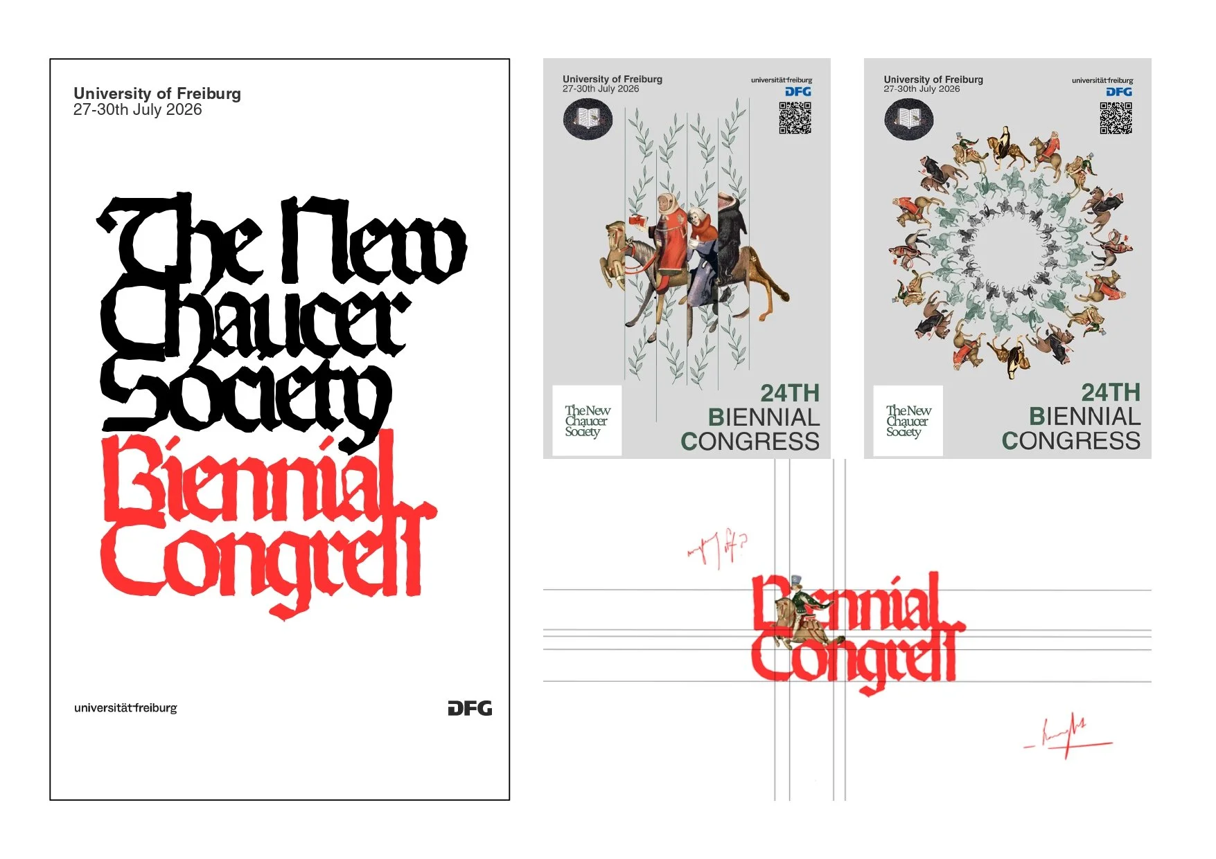
The process of designing the posters for the NCS Biennial Congress, for example, always begins with a conversation. The early pitches are sketched out across a practice of foraging open source media (the Ellesmere Manuscript is a vital resource for this step) and seeing how they speak to grids. Grids in design are not limitations, but an essential part of remembering the importance of communication. How people read posters is just as important as what is being said, and in this way, designers are part-time reception scholars in the way they model font sizes, pairings, and colour combinations based on an ever-mediating contact with the viewer. For example, the original green (#3E5E4D) colour palette of the NCS teaser poster was changed to grey (#D9D9D9) because the host building in Freiburg, Kollegiengebäude I, is much darker than the online advertising format.
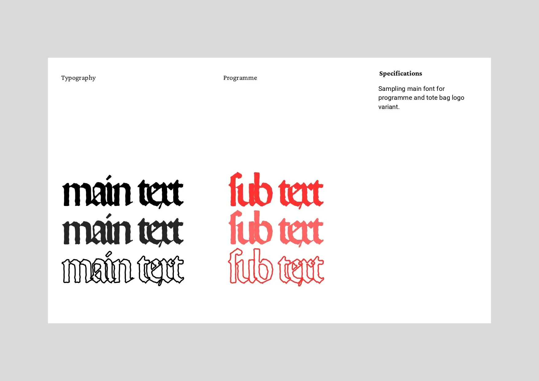
Being a medievalist means my process is often self-reflexive on my research practices. How does the way I treat the Ellesmere pilgrims in design reflect on my narratological focus on character? What does sampling Middle German fonts say about the way I want the programme design to be read? How do I design like a researcher and research like a designer? It has taught me to value the question and not the answer, and with each project, each collaboration, and each conversation, I learn to appreciate the verb (I design) and not the noun (I am a designer).
Project
Working as a designer on the local committee for the upcoming NCS Biennial Congress has helped shed light on the importance of considering the public view when designing for large events. Design choices are shaped not only by style, but by usability, legibility, and access. Can your attendees have access to your materials? Has safety been considered in the design? Is it, simply put, readable for a large audience? A habit I picked up working in York was going to train stations, large cafes, and public buildings whenever I am working on event design. The space, the rush of people, helps foreground the prospective environment and reminds me that these designs are space-shaping as well as space-inhabiting. For the Congress, I have designed the following: teaser posters, main draft programme posters, event posters with eight colour variations, internal style sheets, the print programme, New Chaucer Studies: Pedagogy & Profession bookmarks, AR-scannable postcards, tote bags, signage, and online advertisement assets.
Design is not a solo career. It is a long way of saying “let me see from your eyes,” and for a large event, you will need a lot of eyes. Anna Opanasenko, in particular, has been an amazing partner-in-design in this process. We have had many kaffees and kuchen while discussing print costs, alternative layout design, and some exciting code to bring postcards to life. With the local committee and support from the Guild, the NCS Biennial Congress design will reflect the people and the space through a collaborative effort that reminds us there is no single designer, just as there are many scribal hands at work on a manuscript. A special thank you to all members of the local committee for their patience, diligence, and continued enthusiasm.
Peek
Here are behind-the-scenes deck slides and WIP concepts of programme designs, posters, and typography for the Congress.
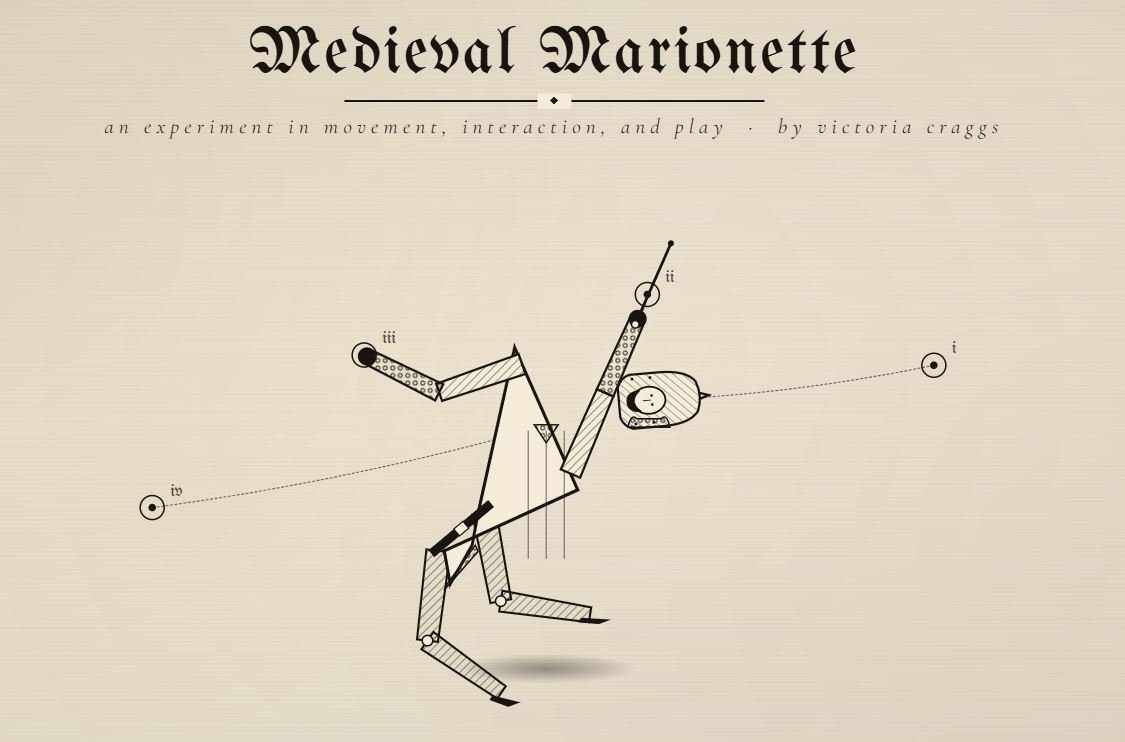
As an extra to showcase the development-side of my work outside the Congress, I have an example of some code experimentation with MediaPipe and interactive design with a digital medieval marionette that you can play with.
Prompt
Imagine your dream conference. Pick the dream place, time of year, and topic. Your task is to make a poster, either a CfP or a general advertisement (you can have fun with the keynotes by adding your friends and colleagues!).
Here is a step-by-step guide to help:
Begin with a moodboard. Go to Pinterest, Public Domain Archive, or Google and search via topic: medievalism, gender studies, Arthurian legend, etc.
Moodboard some of your favourite conference posters for best practice.
Research design grids. Start here: https://swissgrid.posterhouse.org/. Begin mapping where you want to put information (main title, image, keynotes, QR code, short description, date and time).
Using your moodboard, build a colour palette. Search pairings here: https://www.color-hex.com/color-palettes/.
The next step is font pairings. For a poster, 2 is usually a good balance. One for a title and keynotes, and another for supplementary information. This site will help you with pairings: https://www.figma.com/resource-library/font-pairings/.
This is the fun part. Start playing with your media. Try different approaches. If you were to make this poster in three different ways, what would change in each?
